A/B Testing
Case Study

Optimizing the Settings Page Navigation for a Web Application
Background
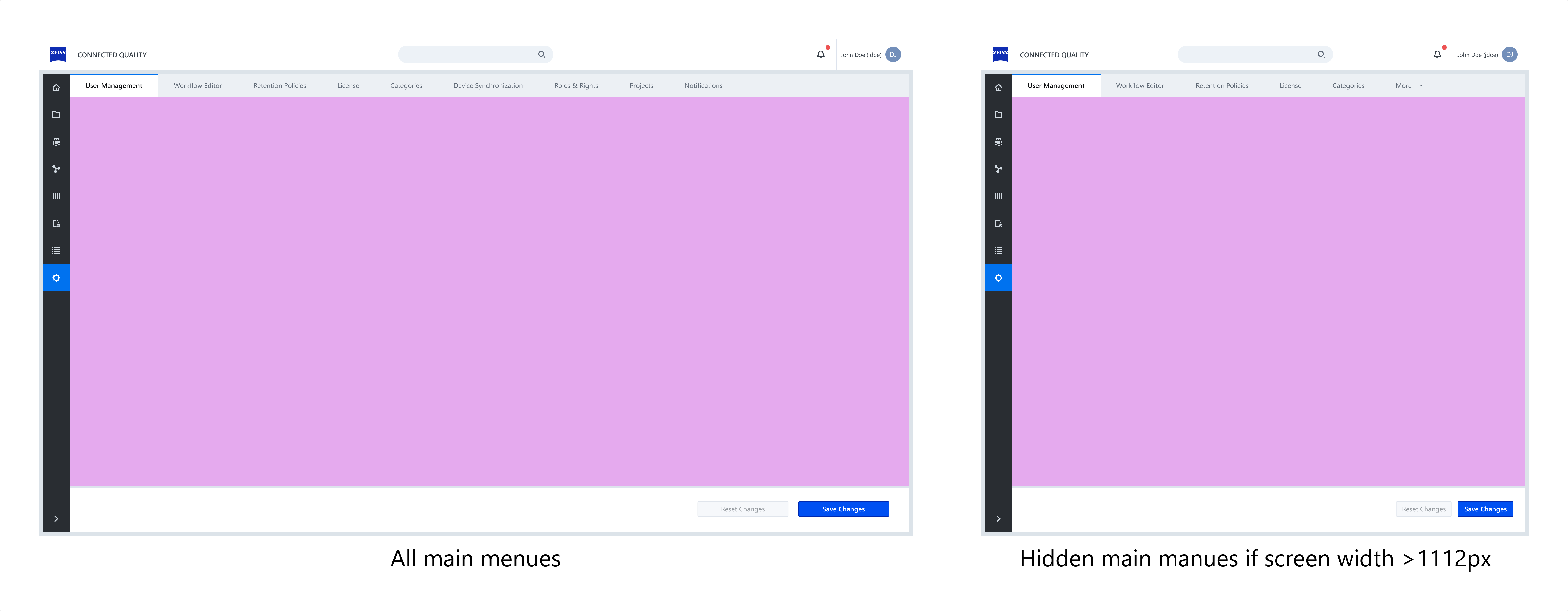
The goal of this A/B test was to evaluate which redesign of the settings page in a web application provides a better user experience. Over time, multiple settings had been added, each assigned to a separate tab, leading to a fragmented and inefficient navigation structure.
Problem Statement & Objectives
Users struggled to navigate the settings page due to the large number of individual setting pages and tabs. The lack of a clear organizational structure resulted in higher cognitive load and inefficient task completion.
Proposed Solutions
To address these usability issues, two alternative navigation structures were designed:
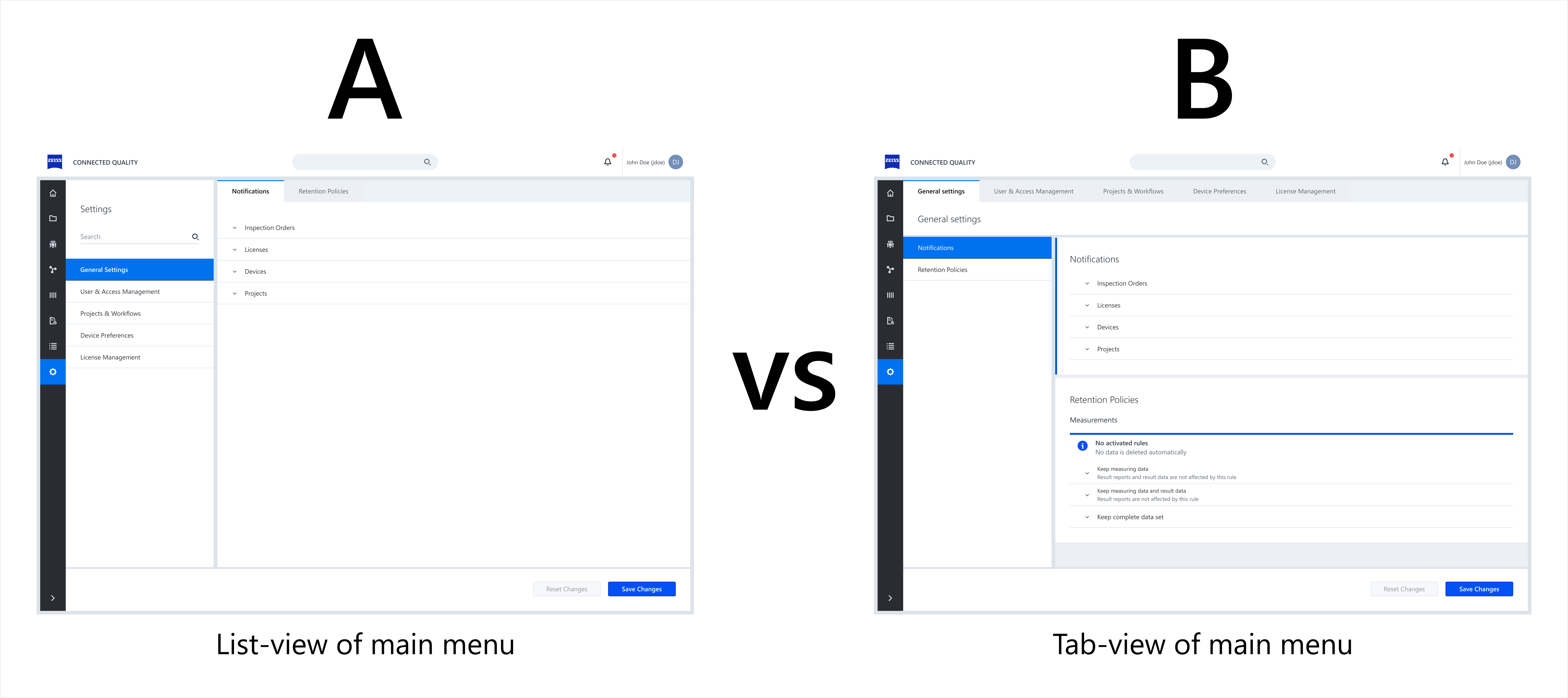
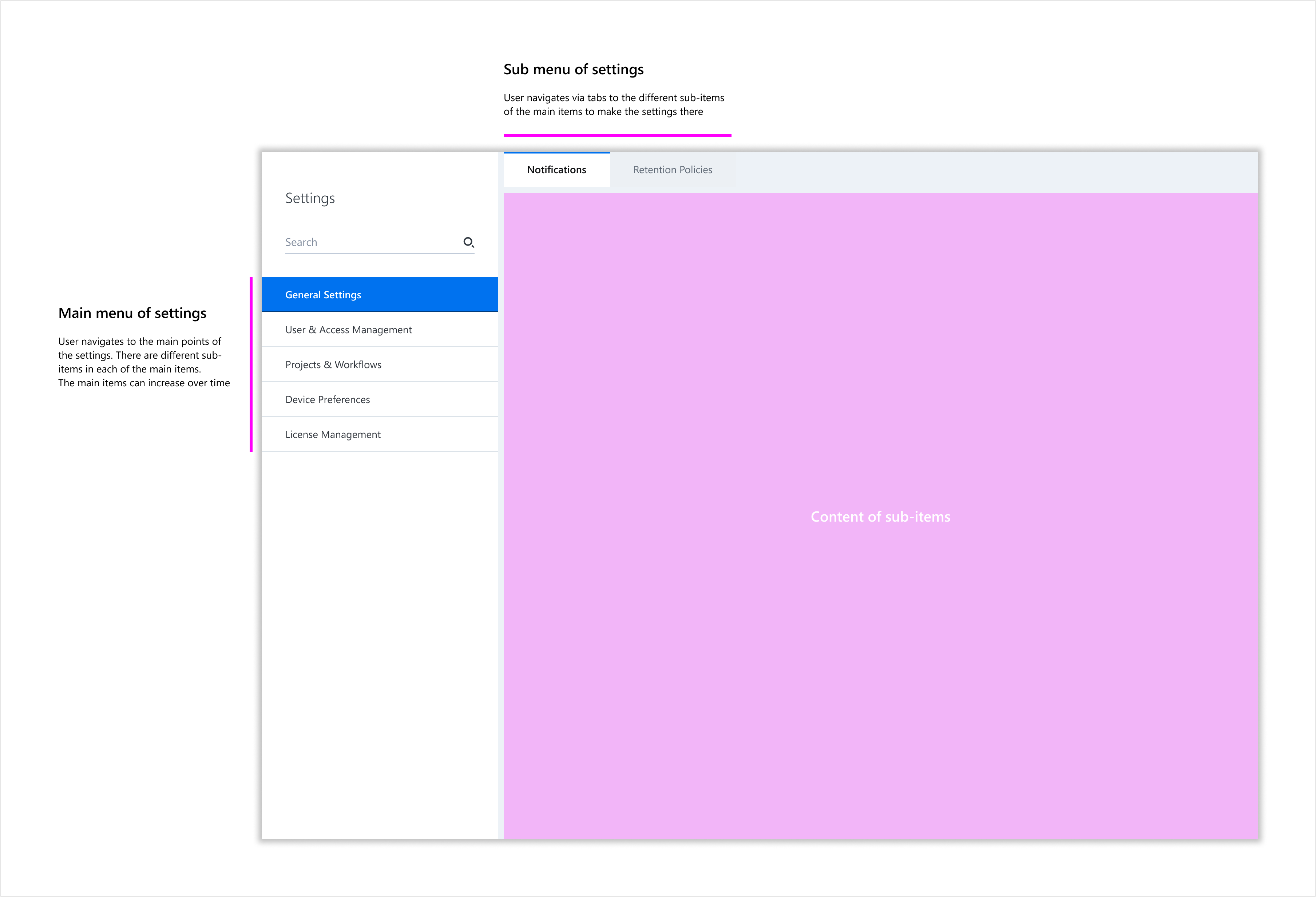
Variant A:
Primary navigation positioned on the left sidebar. Subcategories are displayed as tabs, with each tab showing a single content view.
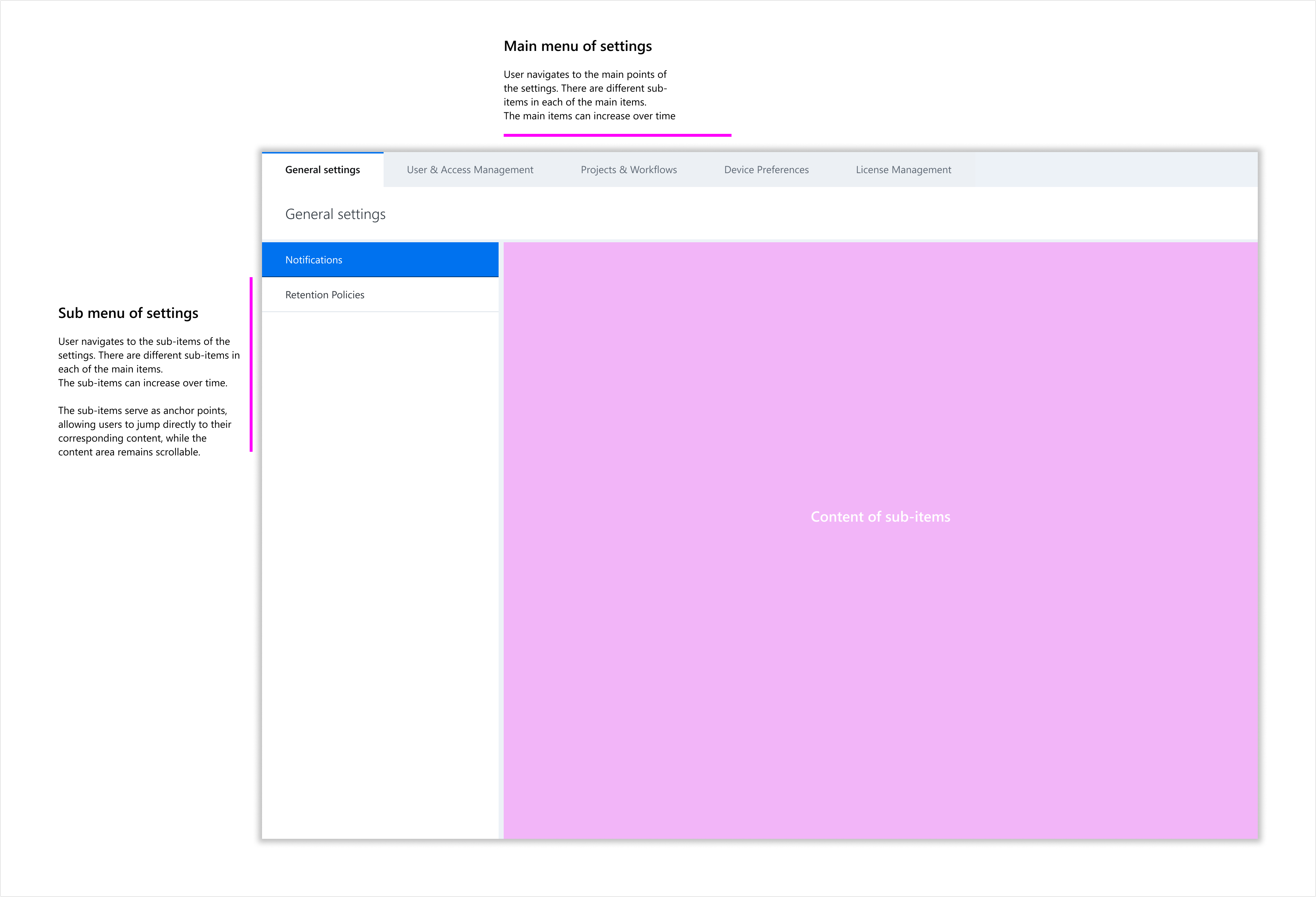
Variant B:
Primary navigation presented as tabs. Subcategories appear as links in a left sidebar. All settings under a main category are displayed in a scrollable view, with the left navigation acting as anchor links.
Testing Methodology
A quantitative usability test was conducted with 6 participants.
To eliminate order bias, participants were randomly assigned to start with either Variant A or Variant B.
Each participant was given the same task: find and modify a specific setting within the interface.
Metrics recorded:
- Task success rate
- Time on task (measured in seconds)
- User error rate
- Subjective usability perception (measured via the System Usability Scale (SUS) questionnaire after each task)
Key Insights
1
Task success rate
Variant A: 8,83 clicks
Variant B: 3,83 clicks (56,63% less)
2
User error rate
Variant A: 4,83 misclicks
Variant B: 0,83 misclicks (46,36% less)
3
Time-on-task
Variant A: 42,55 seconds
Variant B: 31,5 seconds (27.17% faster)
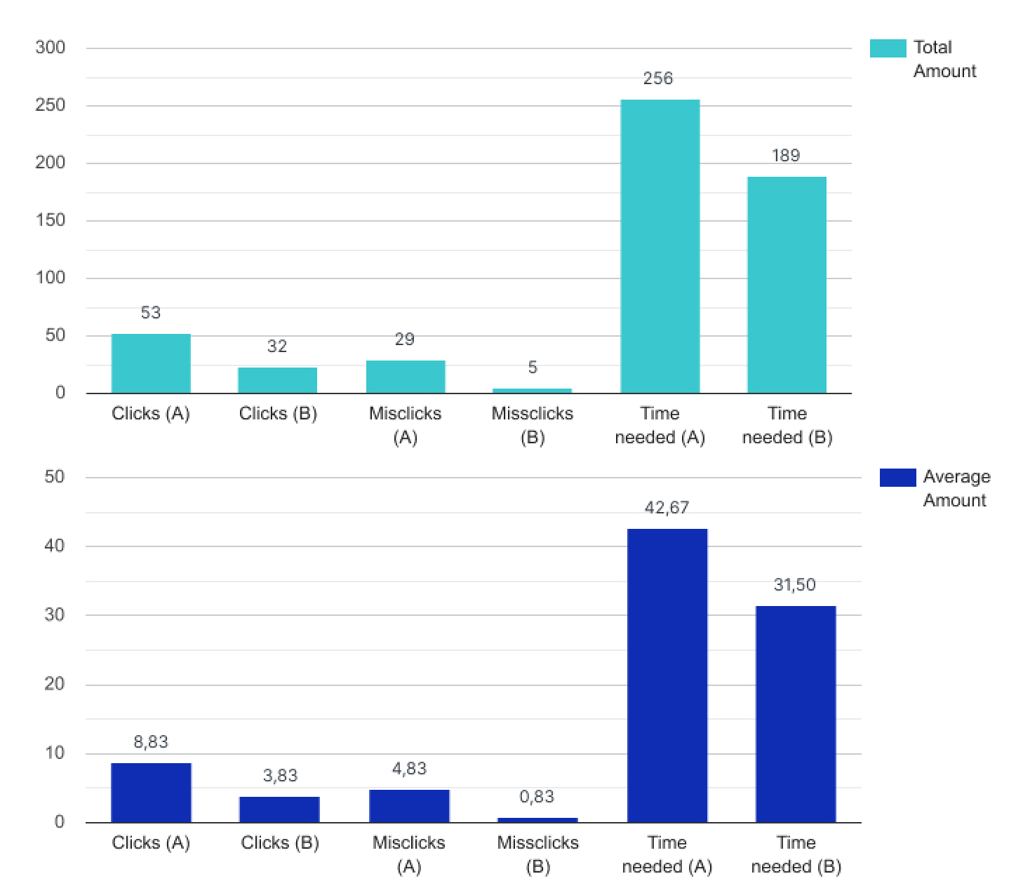
Total vs average of testing results
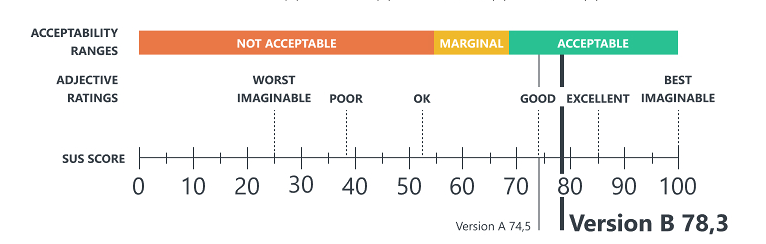
System Usability Scale
Learnings & Key Takeaways
The results indicate that Variant B significantly improved task efficiency and reduced navigation friction. Users completed tasks faster, made fewer errors, and required fewer clicks, leading to an overall better usability score.
The findings were used, among other things, to refute misunderstandings and prejudices of product management and product owners through measurable results
For further optimization, qualitative insights (e.g., user feedback and eye-tracking data) could be collected to refine the navigation structure even further.
Credits
ZEISS IQS
Contact
Kevin Bareiss
Stuttgart, Germany
Email: hello@kevinbareiss.com
LinkedIn: Kevin Bareiss
© Kevin Bareiss 2021